Week 2
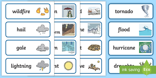
In todays studio we were asked to brainstorm words related to the chosen data category and then pin images corresponding to those words. I had selected 'Weather'.
 |
| Change |
 |
| Elements |
 |
| Conditions |
Week 3 - Sketches

To keep the shape, I used tape as the main source as it is too thin to glue unless stacked. Moving forward I can see paper being used to create shadows and enhance lighting. Both folds are examples of dividers.
Week 6 - Photos of Models (1:20 Scale)
Today in studio, I created two shell models my room in 1:20 scale. Left model uses printing paper and the right is box board. The shell is a draft and will be the catalyst for my next project model of the new proposed model.
Moving forward I want to focus on tangible elements such as exterior lighting from the environment and cutting sections and dividing spaces to have light shine through but more so control the mood of the surround space with new elements.
Moving forward I want to focus on tangible elements such as exterior lighting from the environment and cutting sections and dividing spaces to have light shine through but more so control the mood of the surround space with new elements.
Using Fusion360 and the youtube tutorials, I rendered 3D modelling using my initials: R/K.
Despite having the video guide me, I had faced issues through creating the outline of the letters especially R as the arc tool selection was difficult to understand.
Next studio will be focused on changing the attributes of the model with different textures and colours.

Week 7 - Models with Light
I integrated geometric shapes with the roof to allow light to shine through the space and create different moods and shape the environment.Depending on the time of day, shadows will be big and small. The video guides from the tutorial exposed me to different ways to bare light while still keeping an architectural element to it.
Week 8 - Initials (Fusion 360)
The reflective rose gold like finish reflects the style and a mark of success and wealth in future.
Week 8 - Photoshop Models in Environment
 I have photoshopped the final model in three different environments. Top one represents the space. How it is spacious and homey. The sand dunes and clear blue skies draw in the nostalgia of holidays and evoke the sense of calmness. This environment holds the value of life and tranquility.
The purple sky where the model is resting capitulates the loft. Reminding ourselves that after a busy day comes the slow tides. This environment further supports the relaxation space above. Using the geometric pattern roof to catch the sunset.

The greenery trees and grass environment paints the very opposite of city. Creating that formal divide and exposing oneself to nature and its offers encourages new hopes and passions. The balcony helps promote the mind to be exposed to new challenges and ground oneself. The trees and open land is a contrast to my current living: city apartment.
Week 9 - Statement of Intent
The aim of this project is to develop and refine my current bedroom. Tunnelling in the natural sunlight and basking the room adds contrast and balance to the duplex project designed. The roof has been fitted to have a large sky light panel parallel to the bed to widen and lift the surrounding space. It is crafted with geometric shapes to enhance and modernise standard roofing. The basking sunlight is a sustainable resource that can be used for light.
After evaluating the space, creating a duplex environment that formally separates the blend of work and life was the solution. The divided space will further communicate the intended use of the area and the new integration of stairs invites you to a secluded loft that will be an escape from the busy environment that is below.
Below has a balcony extension that projects outside. This is to connect with the 5 senses cohesively. It’s designed to be an escape and to be grounded. Stepping onto the balcony and experiencing nature.
Throughout this project, my focus is to have a forward dynamic shift in the surround space that further communicates the original environment with integrations.


These photos capture multiple angles showcasing craftsmanship, lighting and space. Adding on to the statement of intent, this duplex project has faced a lot of mishaps and has been remodelled to what it is now. Incorporating geometric shapes to the roof adds not only adds a visual element but also a practical one.
Allowing natural sunlight to bask in the space within is environmentally more sustainable. The duplex environment supports the work/life balance. Formally isolating the two spaces drives creativity and allows for a well rested sleep.

 Each space will have distinct designs and furnitures to further submerge into that environment (work/life).


